


“This article contains affiliate links. If you choose to purchase through them, we may earn a commission at no additional cost to you. We only recommend tools that genuinely improve planning efficiency.”
Not everyone wants to sit at a desktop to design a room.
Ideas strike on the couch.
During a commute.
While walking through the space itself.
Mobile-first creativity is real.
The challenge is precision.
Most mobile design apps feel limited, imprecise, or overly simplified. They’re fine for inspiration boards, but weak for real planning.
The good news is that some platforms — including Planner 5D — now offer cross-device functionality that allows serious design work on phones and tablets without sacrificing layout accuracy.
This guide walks you through how to set up, optimize, and actually design efficiently from a mobile device.
Step 1: Set Up Your Project Correctly From the Start
Mobile design becomes frustrating when projects aren’t structured properly.
Before placing furniture, take five minutes to:
Input accurate wall dimensions
Adjust ceiling height
Place windows and doors precisely
Confirm measurement units
On Planner 5D, the mobile interface mirrors core desktop functionality, allowing accurate dimension input rather than approximate dragging.
Precision at setup prevents frustration later.
Small measurement errors multiply quickly.
If you’re physically inside the room while measuring, mobile entry can actually increase accuracy because you adjust dimensions in real time.
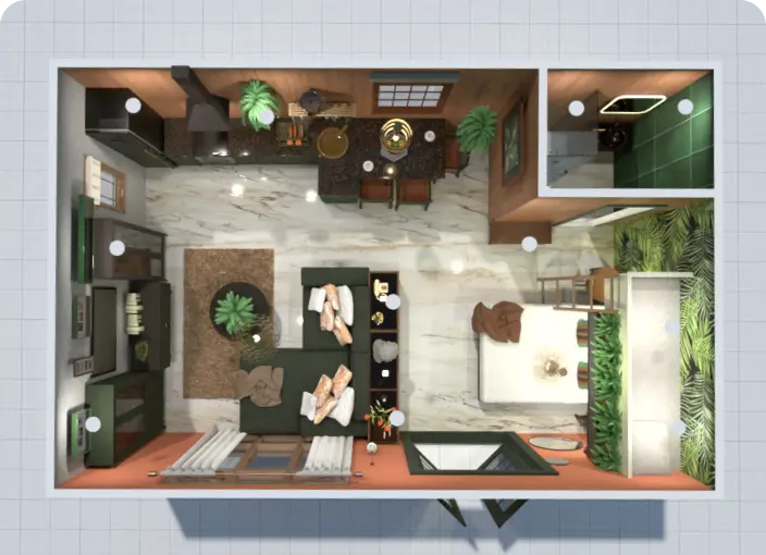
Step 2: Use 2D Mode for Structural Edits
On smaller screens, structural edits are easier in 2D mode.
Walls, doors, and windows require precision taps and alignment.
In Planner 5D, switching between 2D and 3D views is seamless even on mobile. But when editing structure:
Stay in 2D.
Zoom in carefully.
Adjust one element at a time.
This avoids accidental object shifts.
Once structure is finalized, switch to 3D for evaluation.
Step 3: Optimize Furniture Placement With Zoom and Grid Controls
Furniture placement on mobile can feel less precise than desktop unless you use the tools intentionally.
Here’s a simple mobile optimization method:
Zoom before placing objects
Use grid alignment features
Resize objects numerically when possible
Rotate using controlled gestures
Rushing placement leads to distorted scale perception.
Zooming improves control dramatically.
Planner 5D allows object resizing and repositioning with precision controls even on smaller screens, which keeps layouts realistic.
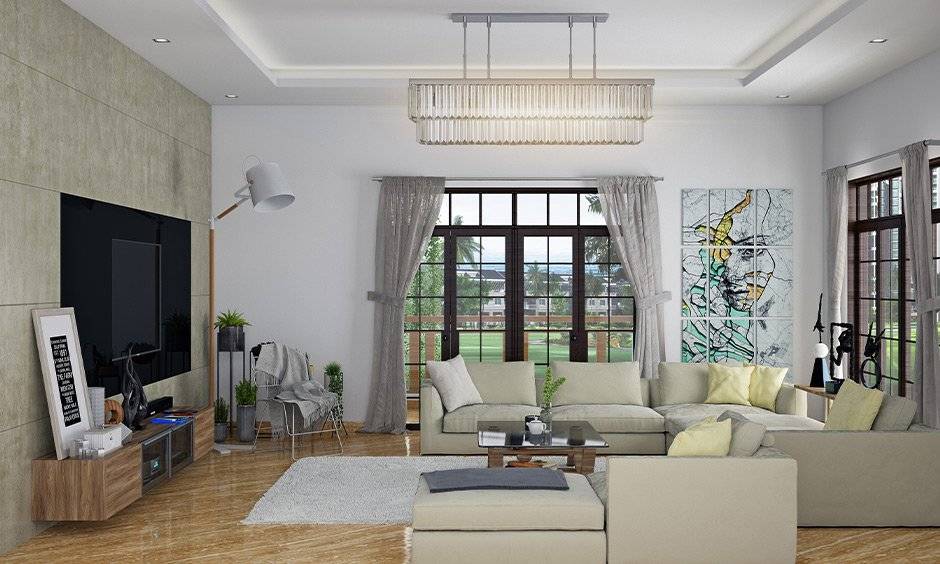
Step 4: Use 3D View Strategically, Not Constantly
While 3D mode is visually satisfying, it can slow down structural edits on mobile devices.
A more efficient workflow:
Design in 2D
Evaluate in 3D
Return to 2D for corrections
Finalize with 3D walkthrough
This loop maintains both accuracy and visual clarity.
Frequent perspective checks prevent proportion mistakes.
Step 5: Sync Across Devices for Maximum Efficiency
One of the biggest advantages of Planner 5D is cross-platform synchronization.
You can:
Measure and rough out layouts on mobile
Refine details later on desktop
Review projects on tablet during consultations
Make quick edits from your phone
This flexibility supports creative momentum.
You don’t lose ideas because you’re away from your laptop.
For mobile-first users, this continuity is essential.
Step 6: Generate Visual Previews Directly From Mobile
Many users assume high-quality rendering requires desktop software.
However, modern platforms increasingly support rendering from mobile devices as well.
With Planner 5D, users can generate visual previews that help:
Evaluate lighting
Review material choices
Share concepts instantly
Gather feedback quickly
While complex projects may benefit from desktop processing power, mobile rendering is often sufficient for layout validation and client communication.
Common Mobile Design Mistakes to Avoid
Mobile design is efficient — but only when used carefully.
Avoid these errors:
Designing without exact measurements
Placing furniture without zooming
Ignoring grid alignment
Relying only on 3D view for structural changes
Forgetting to save or sync progress
Small habits create large quality differences.
Who Benefits Most From Mobile Design?
Mobile-first design is ideal for:
Homeowners measuring spaces on-site
Contractors reviewing layouts mid-project
Real estate agents presenting visual concepts
Students sketching ideas between classes
DIY designers testing ideas casually
If you prefer flexibility and mobility over fixed desktop sessions, tools like Planner 5D make that workflow practical without sacrificing structural accuracy.
Final Thoughts: Precision Is Possible on Small Screens
Designing from a phone or tablet no longer means compromising quality.
The key is intentional workflow:
Structure in 2D
Evaluate in 3D
Zoom for precision
Sync across devices
With thoughtful use, Planner 5D allows mobile users to design accurately, visualize confidently, and move projects forward without being tied to a desk.
Your design tools should be too.


